- 1. Projects
- Adding members to your project
- 2. Boards and columns
- Customising your workflow
- Grouping your board by different categories
- Searching, sorting and filtering your cards
- 3. Cards
- Moving cards through your workflow
- Managing card properties
- Adding custom fields to cards
- Changing what information is shown on your cards
- Timing your cards
- Deleting cards
- 4. Views
- Table view
- Gantt view
- 5. My work overview
- 6. Communicating with team members
- Communicating directly on cards
- Communicating using the communication screen
- 7. Reporting
- 8. Managing your account
1. Projects
Projects are how you group your work in Singular. You can create as many projects as you want, each with a different purpose. You can have projects for specific work projects, for organising a cake sale, for house moves, for organising your life, or for anything else you can think of. Projects can be things that you work on by yourself or they can be collaborative. You can decide who to invite to your projects.
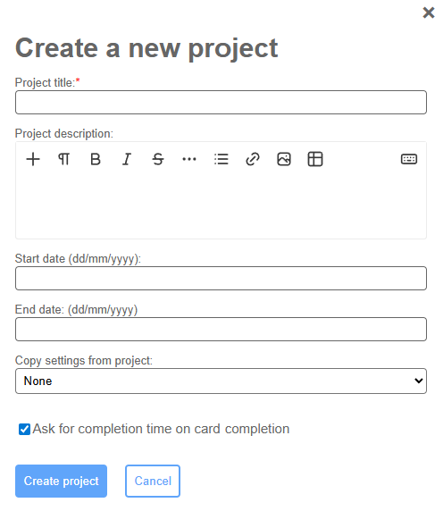
When you first log in to Singular, you are brought to the Projects screen, from where you can open any existing projects or create new ones. To open an existing project, simply click on the 'Open project' button on the selected project tile. To create a new project, click on the "Create new project" button at the top of the screen. When you do this, a dialog window pops up where you can add a project title, a project description, and a project start and end date. You can also indicate here if you want to copy the project settings (including custom workflows and custom card fields) from an existing project, and indicate whether you want to enable time recording for your completed cards. When you tick the box labelled 'Ask for completion time on card completion', you will be prompted to enter how long you spent on completing a task whenever you complete one. You can always change this setting (or any of the other properties) later by clicking on 'Actions' on a project tile and selecting 'Edit'.
Once you have created a new project, you are automatically taken to the board view for your newly created project.
Adding members to your project
If you want to add other people to your project as project members or viewers, you can click on "Project team" in the left-hand navigation menu. To add someone to your project, start typing their name in the "Add user to project team" field and when their name shows up in the drop-down list click on it. You can only add people who are on your account so if their name doesn't show up you first need to add them to under the "Account" screen accessible via the left-hand navigation menu. Managing your account is covered later in this guide under "Managing your account".
Once you have added someone as a member to your project, you can change their role between collaborator and viewer. Collaborators can make changes to a project such as adding new cards, editing card properties, and changing project settings. Viewers have view-only access and can't make any changes to your cards or project.
To remove someone as a member for a project, click on the cross in the "Actions" column to the right of their name and email address.
2. Boards and columns
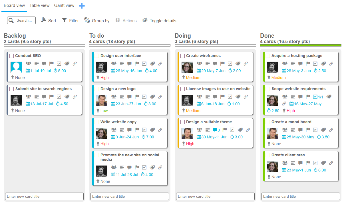
Boards are the default way in which Singular shows your work for a given project. A board is divided into columns which by default represent a workflow going from "Backlog" to "To do" to "Doing" to "Done". However, a workflow is not the only way in which a board can be broken down and and you can fully customise this for instance by having columns signifying different sprints if you're running an Agile project, or representing different customers who you do work for, or anything else you can think of.
Each column shows how many cards are in that column, how many story points are allocated to those cards, and a progress bar indicating what proportion of cards are done in that column.
Customising your workflow
You can customise your workflow by going to "Settings" on the left-hand menu. At the top of this screen you see the categories by which the board can be broken down. At the top of these is "Status", which by default has four options (Backlog, To do, Doing, and Done). You can rename these options, add additional ones (using the "+" sign after the word "Status"), change the colour of them (by clicking on the coloured box next to an option), reorder them (by dragging the icon which appears when you hover over an option), or delete them (apart from "Backlog" and "Done" which can be renamed but not deleted as they have a special meaning).
By default, there are three categories (Status, Priority and Size) but you can add others (such as Sprint, Workstream, Customer, etc.) by clicking on the "Add new category" button. You can also change whether each category is shown on your cards by clicking on the eye icon after each category label.
Grouping your board by different categories
On the board view, you can select the grouping for the columns and rows by clicking on the "Group by" link at the top of the board and selecting the category to group the columns and rows by. By default, the columns are broken down by status and the rows are not broken down.
If you want to simultaneously organise your cards by priority and by owner, you can click on the "Group by" link at the top of the board and from the "Group by" dropdown select "Priority" and then from the "Group rows by" dropdown select "Owner" and click on "Apply".
Searching, sorting and filtering your cards
You can search the cards on your board by using the Search field at the top-left of the screen. If some of your cards have tags you can also search for specific tags here by typing the first few characters of a tag and then selecting it from the drop-down list. To remove a tag from the search list, click on the cross-icon on the right-hand side of the tag and the board will no longer hide cards that do not have that tag.
To sort the cards on your board, click on the "Sort" control at the top of your screen and select the property to sort your cards by from the "Sort by" dropdown and the sort direction (ascending or descending) from the Direction dropdown.
To filter the cards on your board, click on the "Filter" control, and then tick all the options that you want to filter your cards by. For instance, if you want to show all your own cards with medium or high priority, click on the tick boxes for '"Medium" and "High" under "Priority" and on the tick box next to your name under "Owner".
3. Cards
Cards are the building blocks of your projects in Singular. A card most often represents a task but it can represent an idea, a client, or anything else that you need to manage or remember. Singular cards are very versatile and can hold any number of pieces of information (or properties), including a title, an owner, any number of collaborators, a description, a chat history, flags, subtasks, tags, attachments, start and due dates, story points and any number of custom fields.
To create a new card, simply type the card title at one of the text fields labelled "Enter new card title" at the bottom of a column and press "Enter". A new card will be added to the bottom of that column.
Moving cards through your workflow
Moving cards through your workflow couldn't be easier. Simply click on the card title and hold the mouse button down (or touch the card title on a touch-screen device and hold it down) and then drag it to the column where you want it to go. Release it once a semi-transparent copy of the card appears in the new column and then release the mouse button or your finger and the card will be added at the bottom of the destination column.
Managing card properties
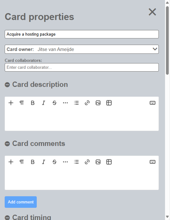
Some card properties (including card owner, card priority and card size) can be changed directly on the card by clicking on the respective property and selecting the new value from the drop-down menu. Other properties are changed on the card panel, which you open by clicking on a card title or on one of the icons on the card which brings you directly to the relevant section on the card panel for changing that property.
Adding custom fields to cards
If the default card properties don't meet all of your needs, you can add custom fields to your cards for a given project. Custom fields can be added from the "Settings" screen. To add one or more custom card fields, go to "Settings" and scroll down to "Custom fields." From there, click on the "Add new custom field" button. A dialog window appears asking you for a label and a field type for your new field. The field types are "Text", "Text area" (for longer, formatted text), "Date", "Number", "Money" and "Selection." Give your new field a label and a type and click on the "Add" button.
By default, new custom fields are not shown on your cards, though you can access them via the card properties panel by clicking on the card title and scrolling down to "Card custom fields." To show your custom fields on your cards on the board, click on the eye icon next to the field on the Settings screen.
Changing what information is shown on your cards
By default, all standard card properties are visible on your cards on the board. If you want to hide some or all properties on your cards, go to "Settings" and scroll down to "Visibility of default properties on cards". From there, you can click on the eye icons to hide each property. If you hide all properties on your cards, only the title and any coloured flags appear on your cards.
Timing your cards
You can record time against each of your cards, either by using the automatic card timer function or by manually adding timer entries for a card.
To start the automatic timer for a card, click on the card title to open it in the card panel and scroll down to the "Card timing" section (or click on the calendar or story points icon to take you directly to the card timing section of the card panel). From there, click on the "Start card timer" button. A timer appears which shows the number of minutes and hours elapsed since the timer started. When you close the card panel, the timer shows in the bottom-right of the screen and you can click on it to open the timed card in the card panel. You can also click on the little stop icon to stop the card timer and add a timer entry to the card for the elapsed amount of time.
You can also manually add or edit card timer entries. To manually add a timer entry, click on the "+" icon on the right-hand side of the "TOTAL" row above the "Start card timer" button. A dialog window pops up asking you for a start date, a start time, and an amount of time spent. Enter the start date using the drop-down calendar, the start time in 24-hour format (i.e., 13:30), and the time spent in hours and minutes in the format 3h 45m for 3 hours and 45 minutes.
You can also edit or remove existing timer entries with the pencil and cross icons next to the entry in the timer table. You can only edit or delete your own timer entries.
Deleting cards
To delete cards, select all the cards that you want to delete by clicking on the empty checkboxes for the cards to be deleted and making sure they are selected with a tick. Then click on the "Actions" link at the top of the screen and click on "Delete selected card(s)."
4. Views
Other than the default Board view, Singular has two more view types. These are the Table view and the Gantt view. To use the Table and Gantt views, you need to first create them for your project. To create a new Table or Gantt view, click on the "+" icon to the right of the "Board view" at the top of the screen. A dialog window pops up asking you for a name for the view and for the view type. Give your view a name and select the type and click "Add".
Table view
Table view, as the name suggests, presents your cards as rows in a large table. By default, the rows in this table are grouped by status, but you can change this by clicking on the "Group by" link at the top of the screen and selecting another category from the dropdown and clicking on "Save to view". The new groupings are now saved to this view so the next time you open this view the same grouping will automatically show.
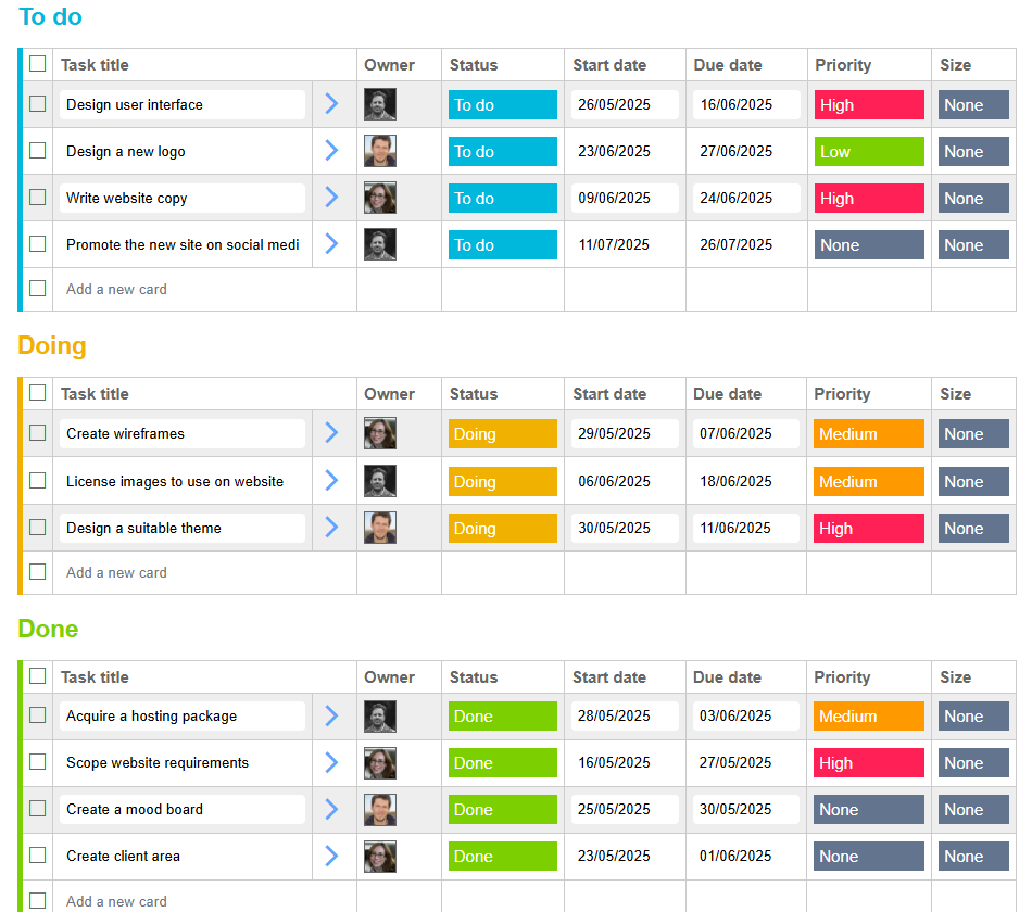
Like in the board view, you can search, sort and filter your cards on the table view in the same way as you do on the default board view.
You can also control which card properties are shown in the columns of the table and in which order by clicking on the "Columns" link at the top of the screen. Here you can use the tick boxes to indicate which columns you want to see and when you hover over a column name a icon shows up which you can drag up and down to reorder the columns. When you click on "Save to view" your changes are saved to the current table view.
Gantt view
Gantt view shows your cards in a timeline which spans from project start date to project end date (so you need to set the project start and end date for your project to use this view, which you can do from the "Projects" screen by clicking on "Actions" for the selected project and then "Edit").
Singular's Gantt view presents an intuitive way to manage card start and due dates and allows you to simply drag start dates, due dates, and timespans to alter card dates in a visual way.
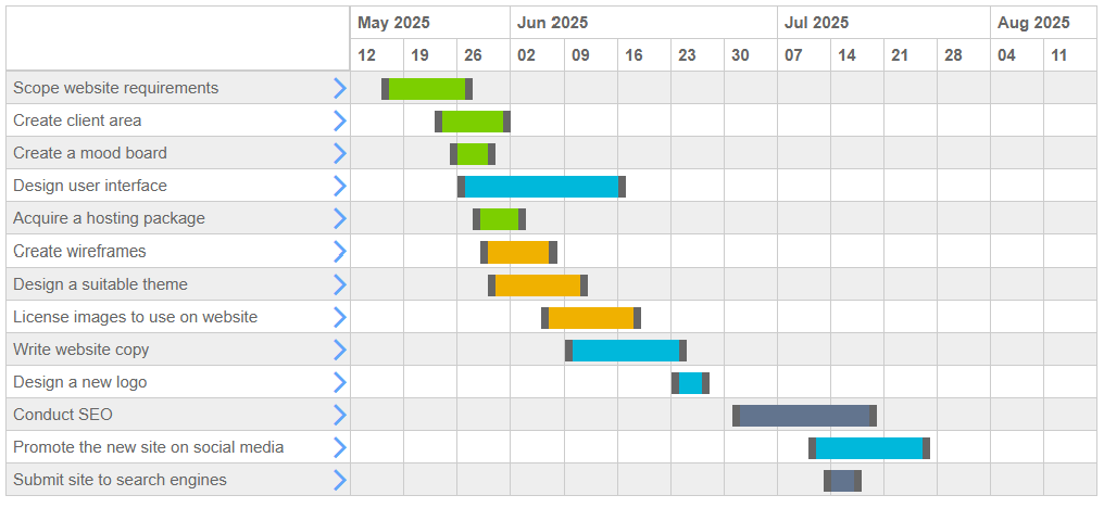
To change just the start or due dates of a card in the Gantt view, drag the grey bars at the start or end of the timeline for a card. To move both the start date and end date at the same time, grab the middle part of the timeline and drag it to the left or right. To create a start and due date from scratch, hover over an empty start date (which pops up as you hover over the different empty coordinates in the Gantt table) and click your mouse button, hold it down and drag it to the required end date.
Like in the board and table views, you can search, sort and filter your cards in Gantt view using the links at the top of the screen.
5. My work overview
The "My work" link in the left-hand navigation brings you to an at-a-glance overview of your work across all of your projects, broken down by overdue tasks, tasks due today, this week, next week, later and cards without a due date. This view only shows uncompleted cards of which you are the owner so if no cards show up it is because no cards have been allocated to you yet across any of the projects of which you are a member or you have completed all your cards.
6. Communicating with team members
There are two ways to communicate with team members on a project: directly on specific cards or via the dedicated Communication screen.
Communicating directly on cards
To communicate directly on a card, click on the title for a card to open the card properties panel and scroll to the "Card comments" section, or click on the chat bubble on a card which will take you directly to the Card comments section. From there, enter your comment in the text area (you can also format your text using the various buttons at the top of the textarea). You can mention other project members using the @ symbol and typing the first few letters of their name and then selecting their name from the drop-down list that appears. Mentioned project team members will receive a notification when they have been mentioned. When you are done typing your comment, click on the "Add comment" button.
Communicating using the communication screen
To communicate via the dedicated communication screen, click on "Communication" in the left-hand navigation menu. A panel pops up on the right-hand screen listing the public and private channels available in this project. To create a new public or private channel, click on the "Create a new channel" button. A dialog window pops up asking you to name the channel and select whether it is a public or private channel.
A public channel is visible to all project members, whereas a private channel is only visible to those on the project who have been specifically invited to it.
A little red badge with a number in it next to a channel indicates that that channel has unread messages. Click on any of the channels to access the messages within it.
Within a channel, you can either post a new message or reply to an existing message. To post a new message click on the "Start a new message" at the bottom of the screen, type your message in the textarea that appears and when finished click on the "Post message" button.
To reply to an existing message click on the "Reply" message at the bottom of an existing message and type your message in the textarea that appears. Then click on the "Post message" button once you have typed your message.
Just like in the card chat function, you can mention other project members in your messages by typing @ followed by the first few letters of their name and then selecting their name from the drop-down list.
7. Reporting
The reporting screen allows you to see key indicators of how your project is doing. At the top of the reporting screen you can select a metric to use in the charts, either cards or story points. Story points are a metric which denote effort, and are normally measured either in days or hours. You can set the number of estimated story points for each card under the "Card timing" section of the card properties panel, and this figure is picked up here in the charts when selecting "Story points" as the metric.
You can also filter the charts by card owner. When you select a user name from the "Filter by card owner" dropdown list, only the cards owned by that project member are taken into account in the figures and charts.
Under the metric and filter dropdowns, there is a collapsed list of overdue cards. To expand the list click on the "+" icon.
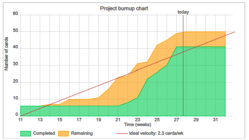
Below that, there is a project burnup chart. The project burnup chart shows the amount of remaining (uncompleted) work (in amber) and the amount of completed work (in green) over time. It is a useful chart to see if a project is on track to deliver by the project end date and the red line represents the "ideal velocity" required to finish the project in time.
Below the project burnup chart, there is a bar chart representing work by status and user. It shows the number of cards or story points broken down by status for each project member.
Below that, there is a bar chart representing the amount of completed work by day. It shows the number of cards or story points completed each day for the past two weeks.
8. Managing your account
Managing your account is easy in Singular. You can access your account settings from the "Account" link on the left-hand navigation menu. From the account settings screen you can invite new users to your account, upgrade or renew your account, and manage user roles and seats.
To invite a new user to your account, click on the "Invite new user" button at the top of the screen. To invite several users at once, click on the "Batch invite users" from where you can copy and paste a list of users from an Excel spreadsheet to invite them. You can only invite users to your account if you are an admin or of all users are enabled to invite new users to the account.
Each account has a number of seats. The free plan has two seats, and with paid for plan you pay an amount per seat. There can be more users on an account than seats and only users with a seat have the benefits of any paid-for plans and users without a seat only have the benefits of the free plan.
To grant a user a seat on your account, select "Yes" from the "Has a seat?" column in the Account members table. You can only do this if you are an account admin (which you automatically are if you created the account) and if there are seats available on your plan.
In the account members table, you can also assign roles to different account members. A member can be either a "User" or an "Admin". An admin can change account settings and allocate seats, whereas a user can only invite other members to an account if this setting is enabled by an admin.
Using the drop-down menu under "Actions" in the Account members table, you can resend an invitation email, make someone an account owner, or remove someone from the account team (the last two options are only available to account admins).
On the Account settings screen admins can also enable or disable all members to invite new users to this account using the checkbox, or limit invitations for new users to only be from a specific domain (such as "your-company-name.com").